Work for
NAAFI
Discipline
Graphic Design, art direction, BRANDING, IDENTITY, SOCIAL
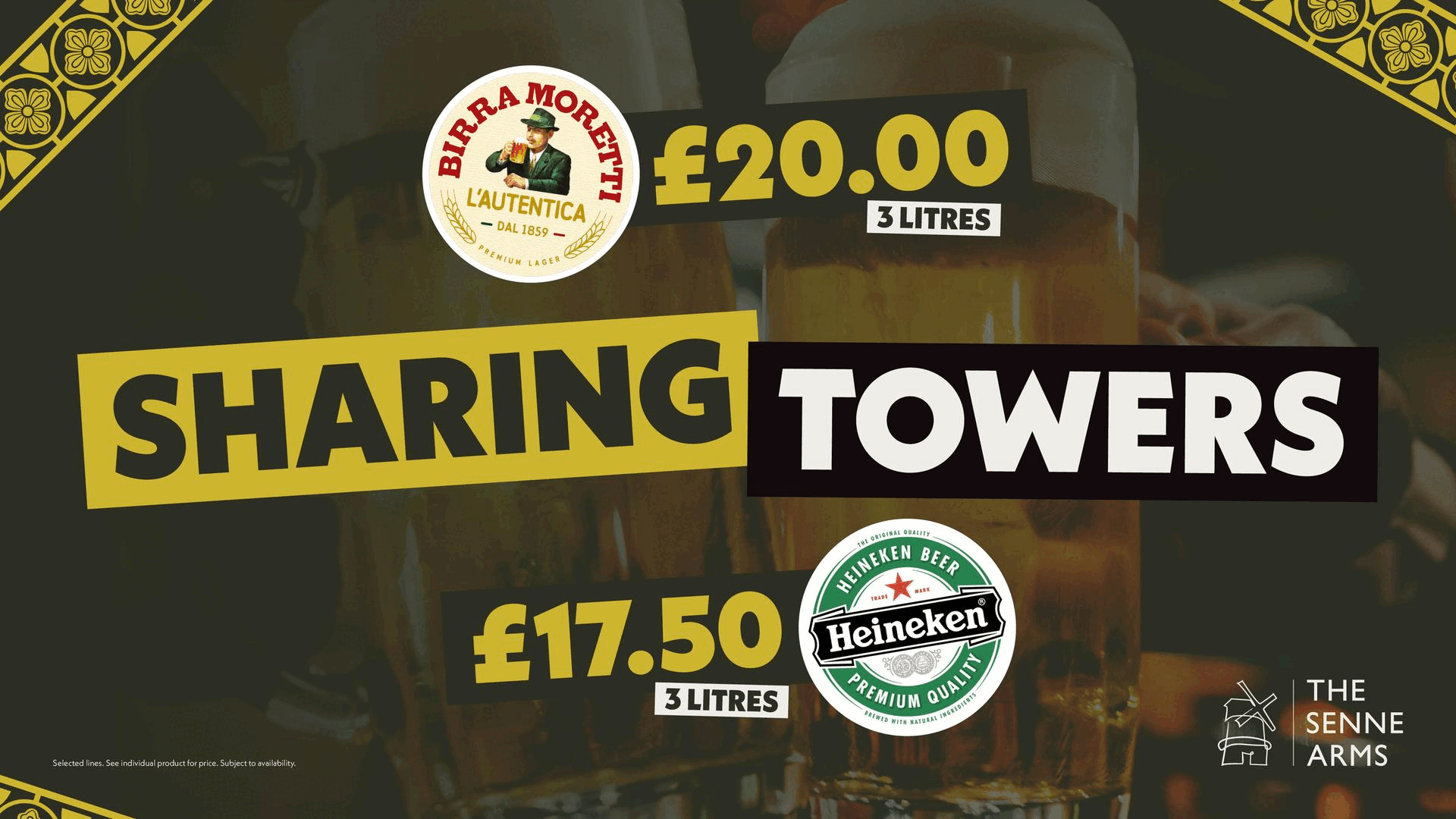
NAAFI is transforming its pubs and hospitality sites, giving each venue a unique identity that connects it to both its location and the Armed Forces community they serve. The Senne Arms in Germany was the first project to receive this new treatment and this project was produced during my role as Social & Creative Lead at NAAFI.
For this rebranding, I created a distinct visual identity that helps serving personnel in Sennelager feel at home. This project went beyond simple design; it was about building a sense of place and belonging.
A BESPOKE IDENTITY
Working with a custom line drawing provided by Concorde BGW Group, I developed a complete brand identity for The Senne Arms. This included a unique colour palette that separates the pub from NAAFI's corporate branding, allowing it to stand out from the crowd. We adopted a shade of Army green to directly link the pub to its surroundings - Sennelager, the home of the British Army in Germany.
To further connect with its location, I chose the German-inspired typeface Neue Kabel. This font is used in various weights for headings and paragraphs, adding depth and visual interest to every piece of artwork. Old fashioned German patterns are also used to further engage the artwork.
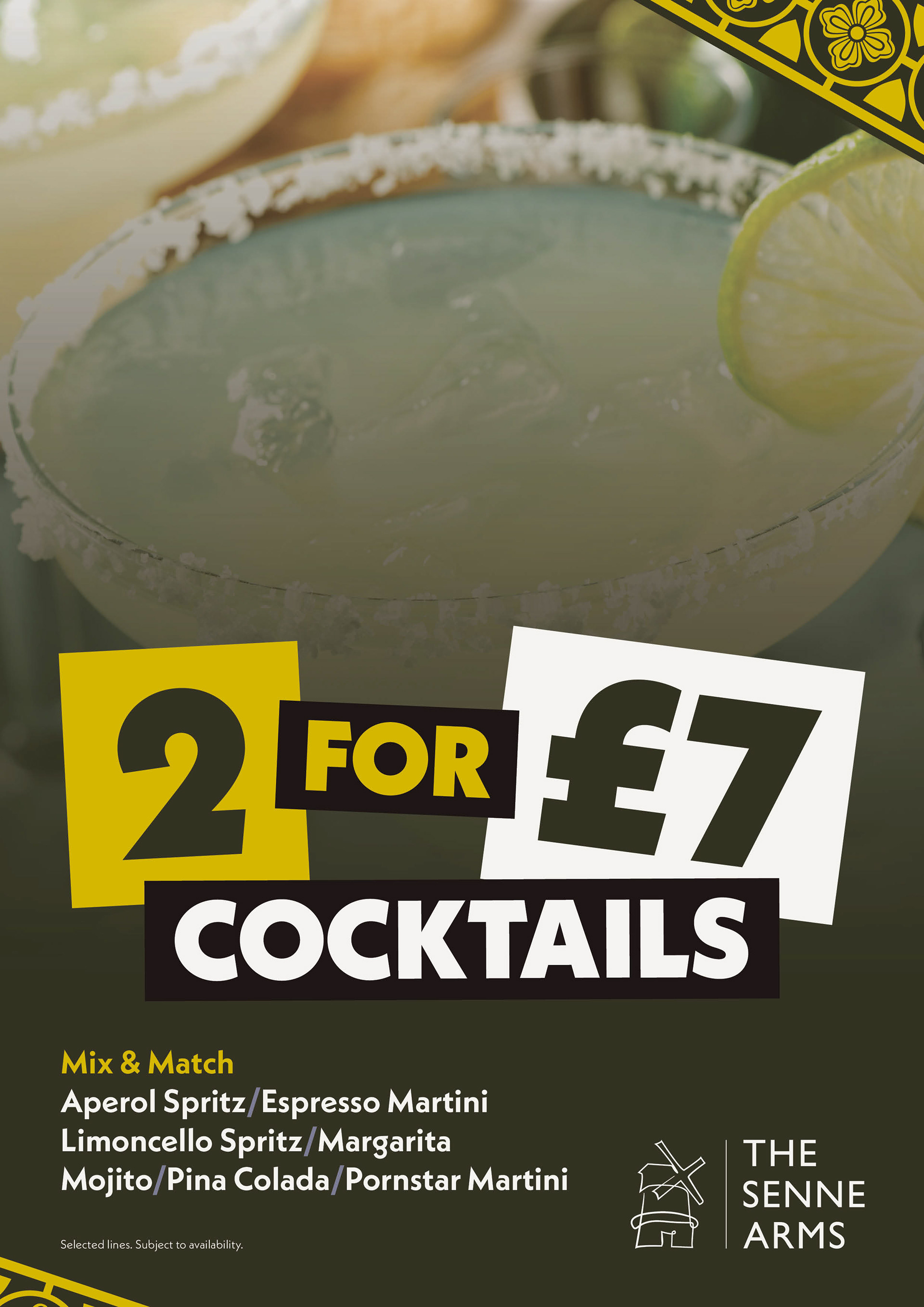
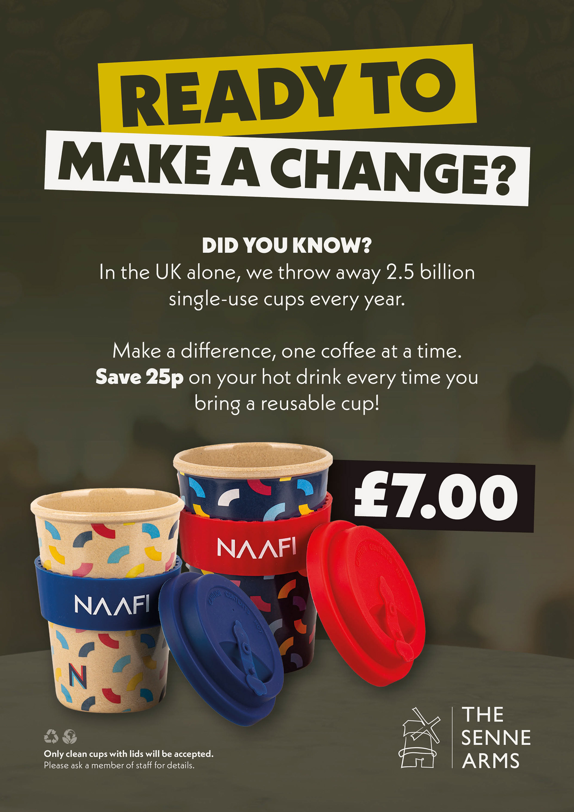
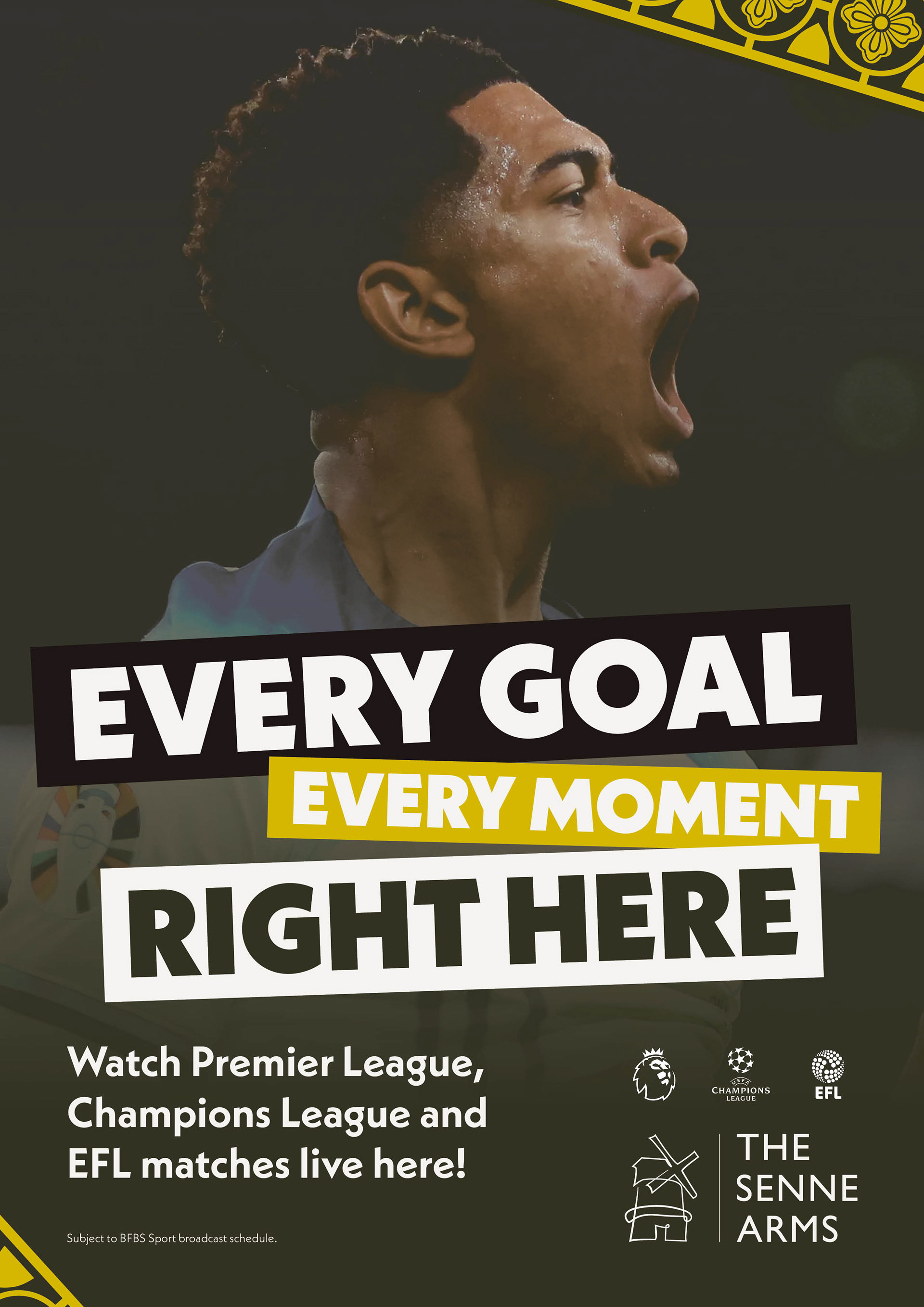
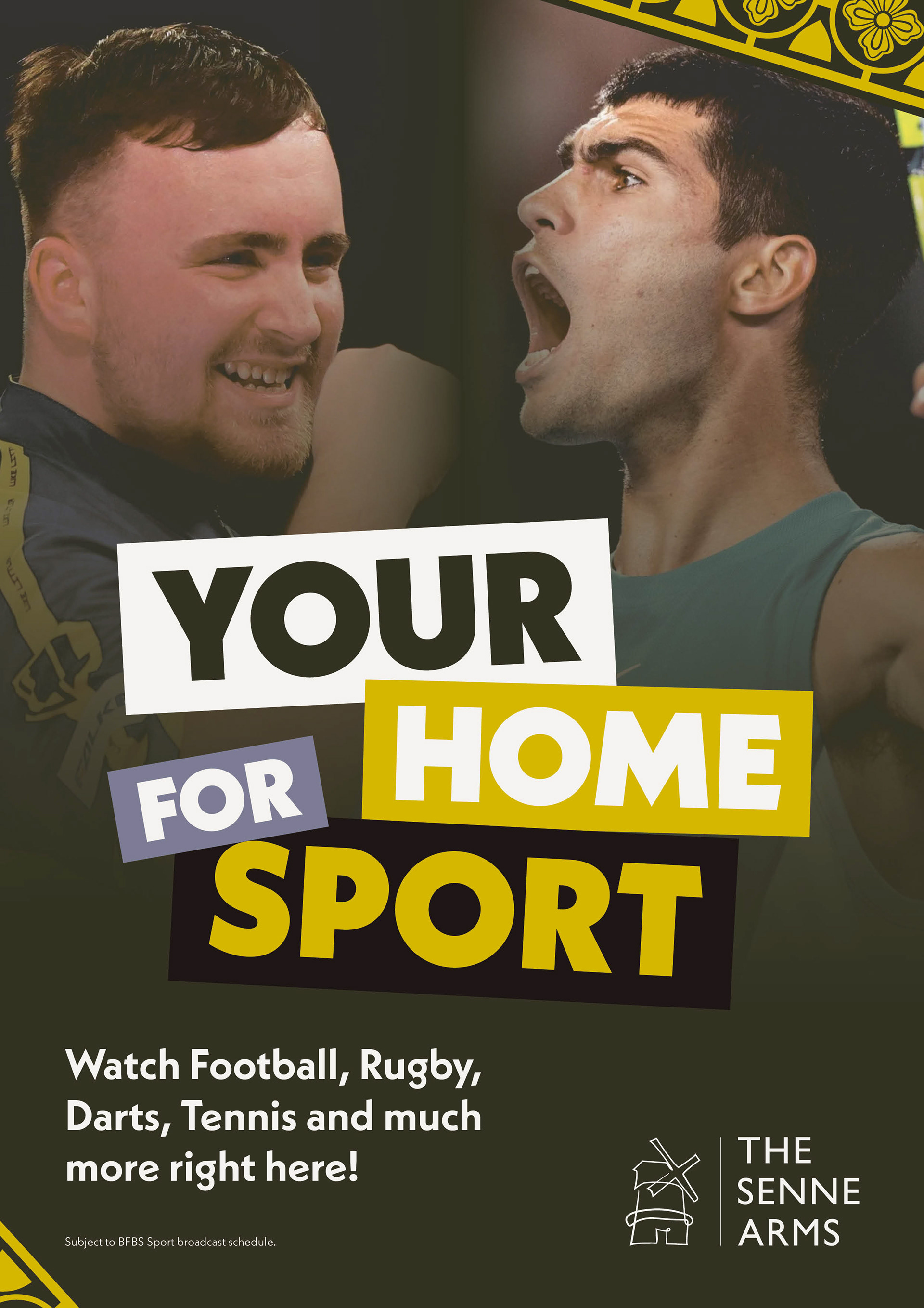
THE DELIVERABLES
The new identity was applied across a wide range of applications, ensuring a cohesive look and feel throughout the pub. This included everything from low-level details like push and pull signs to large-scale internal and external signage.
This brand was also adapted for digital platforms, including content for digital screens and social media assets designed to promote events and showcase food and drink special offers. The result is a welcoming and engaging environment that feels uniquely tailored to its community.